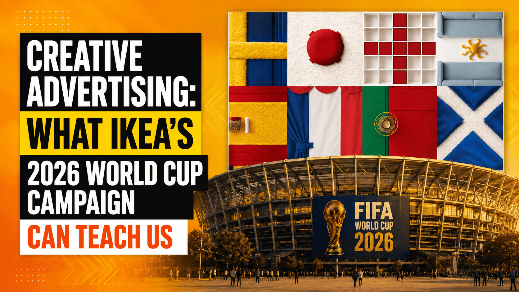
A rug, a few stools, a shelf, or a stuffed toy hardly bring an international football competition to mind. At least until someone decides to arrange them differently, transforming objects designed for the home into the colors and geometric patterns of a national flag.
This is precisely the idea behind “Assemble the World,” the campaign developed by IKEA Canada in collaboration with Dentsu Creative for the 2026 World Cup. The project reinterpreted a selection of products from the brand’s catalog, assembling furniture, accessories, and everyday objects to recreate 18 national flags and building a social-first, interactive, product-connected experience around an apparently simple idea.
Although the campaign may appear merely visually appealing at first glance, a closer analysis of its structure reveals a particularly interesting principle: creative advertising does not always require complex mechanisms to capture attention. Often, on the contrary, its strength comes from the ability to take familiar elements and place them in a relationship the audience does not expect.
Creative Advertising: When the Idea Comes Before Complexity
The pursuit of originality frequently leads brands and professionals to overlap the concept of creativity with that of complexity. The more elaborate, visually dense, or technically sophisticated a piece of content appears, the greater the creative value that tends to be attributed to the campaign.
In IKEA’s case, the mechanism is immediately understandable. The products retain their original form and identity, but they are recombined to create something entirely different. A piece of furniture, a textile, or an accessory is not modified to fit the message. Instead, it is the arrangement of the objects that temporarily changes how they are perceived.
It is precisely this simplicity that makes the idea accessible. The audience does not need to decipher a complex narrative or wait for a final explanation to understand the connection. The image communicates within seconds and, once the mechanism has been understood, it almost naturally encourages viewers to look more closely at the individual elements that compose it.
Why IKEA’s 2026 World Cup Campaign Works
One of the campaign’s strongest aspects is the relationship between the brand and the context in which it chooses to participate.
During a global event such as the World Cup, countless companies inevitably attempt to join the conversation. The challenge, however, is not simply to publish football-related content, but to find a credible point of connection between the event and the brand’s own identity.
IKEA does not manufacture sportswear, sell football equipment, or need to artificially construct a relationship with the pitch. Instead, the campaign starts with something the brand already owns: its catalog.
Tables, textiles, storage solutions, lamps, and accessories become the language through which the event is interpreted. In this way, the World Cup provides the context while the products remain at the center of the communication.
This is an important distinction. Engaging with a current event does not necessarily mean adapting the brand to the conversation of the moment. In some cases, the most effective approach is to do the opposite, interpreting the event through the visual and identity codes that already make the brand recognizable.
Creative Advertising Transforms the Product into a Language
In traditional advertising communication, the product is frequently shown, described, or integrated into a usage scenario. Its function remains central, and the message is built around its characteristics, benefits, or the need it is designed to satisfy.
“Assemble the World” introduces a different dynamic.
Once the flag has been identified, however, attention can shift toward the products used to create it. The social campaign invites audiences to identify the items featured in the images, transforming the creative concept into a mechanism for discovery and interaction.
The result is a form of communication in which the brand, the product, and the creative idea do not compete for attention but work synergistically within the same system.
Visual Simplicity Reduces the Time Needed for Understanding
In an ecosystem defined by endless feeds and increasingly compressed attention spans, the speed at which a message can be understood has become an increasingly important factor.
This does not mean that every piece of content needs to be elementary. Rather, it means that a strong idea should minimize the distance between what the brand shows and what the audience is able to interpret.
From this perspective, flags have a clear advantage: they are visual structures already embedded in collective memory. Their colors and geometric patterns allow for almost immediate recognition, providing the campaign with a semantic foundation that does not need to be built from scratch.
IKEA places its products within this familiar structure, creating a discrepancy that encourages closer observation. The audience recognizes the flag but simultaneously senses that something is different. It is within this space between familiarity and surprise that the creative idea gains its strength and resonance.
Joining a Conversation Without Losing Brand Identity
When multiple companies use the same references, similar jokes, and comparable visual structures, the result can become a double-edged sword. While the connection with current events may become stronger, the brand’s recognizability and distinctive characteristics can gradually weaken.
IKEA’s campaign follows the opposite approach.
Although the reference to the World Cup is clear, the execution remains deeply connected to the brand’s universe. Even when viewing the images without a particularly elaborate message, the presence of household objects and the way they are arranged maintain an immediate coherence with the company’s identity and positioning.
The creativity, therefore, does not overshadow the brand identity. It amplifies it.
This is probably one of the campaign’s most interesting qualities: IKEA participates in a global conversation without ever ceasing to speak its own language.
What This Creative Advertising Campaign Can Teach Brands
Literally replicating the flag concept would offer little value. The truly useful principle lies at a different level and concerns the way an idea is shaped.
Before searching for new tools, formats, or technologies, a brand can look more closely at the wide range of elements it already has at its disposal. Products, colors, shapes, processes, and distinctive characteristics can all become creative material when connected to a particular context through an unexpected perspective.
This is precisely where simplicity stops being synonymous with banality. An idea can be minimal in structure while remaining highly sophisticated in the connection it creates.
When a Good Idea Makes Everything Else Unnecessary
IKEA’s campaign for the 2026 World Cup demonstrates how creative advertising can gain strength by subtracting rather than adding.
A complex narrative, spectacular execution, or heavily explained message is not always necessary. In this case, all that is needed is a selection of products already present in the catalog, a universally recognizable visual code, and an unexpected relationship between the two.
The value lies entirely in the connection.
And perhaps this is the most useful lesson for anyone working in marketing and communication: before making a piece of content more complex, it is worth asking whether the underlying idea is already strong enough to carry the message.
Because when the connection is right, even the most ordinary objects can represent something the audience has never seen in quite the same way before.